

Careful used to be free
For most of my career, being careful was free. AI took the hours by hand — it didn't remove the need to check, it just moved where the check happens.
 Jessica Bland 14 min read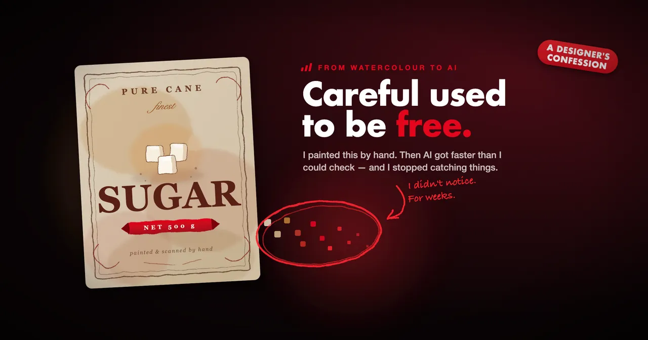
A few weeks ago I asked Claude to add an icon to a screen in an app I’ve been working on for a long time. It gave me a few options, I picked one, and I asked it to implement that option across the designs.
It implemented something slightly different. Not wildly different. Just not the one I’d chosen, and not quite right next to everything around it.
I didn’t notice. I approved it, so our developer built it, which was exactly the right thing for him to do. He sent it back to me for testing, and that’s when I saw it.
It was an icon. Genuinely small, never reached the client, fixed by hand in twenty minutes. But it had gone from my design through a build and back to me before anyone looked at it properly, and every person in that chain did their job correctly. The only step that failed was the one where I was supposed to look.
What bothers me about that isn’t the mistake. It’s that my judgement hadn’t changed at all. I’d have caught it instantly if I’d looked. I just didn’t look, because for most of my career I never had to decide to.
The only step that failed was the one where I was supposed to look.
I used to get there the long way
I did my honours in visual communication, and the work I was proudest of was a packaging project for a sugar brand. I painted the label artwork in watercolour and scanned it in. I photographed a real supermarket shelf and composed my own shelf advertising into it so that it looked like the product was already on sale.
I could make the software do what I wanted, and the project came out well. What I didn’t have was the efficiency of someone properly fluent in it, all the shortcuts that people who live in those tools every day pick up. So I’d arrive at the right result by a longer route. More steps, more manual work, more hours. It never bothered me much. The result was what I cared about.
Looking back, those hours were doing something I never gave them credit for. When you spend a week inside a piece of work you look at it several hundred times. Very little survives that. My perfectionism didn’t need a plan, because the slowness enforced it for me.
What I’m checking for has also changed. Moving from visual communication into UI, then UX, then broader product work, the questions stopped being only about the surface. Does this look right, does it work, does it work for someone who has never seen it before, and can it actually be built?
So the standard got bigger while the time to check against it got much shorter. Careful used to be free. It isn’t anymore, and that turns out to be the part I’ve had to redesign.
Division of labour
This isn’t a piece about AI producing bad work, because a lot of what I’ve seen has been good.
The clearest example is icon sets. I design the first few myself, spending proper time on the weight, the corner treatment, the level of detail, then ask AI to extend the set from those. It isn’t smooth. I have to send it back repeatedly and write increasingly specific prompts before the rest matches what I started. But it gets there, far quicker than drawing every icon by hand, and what comes out is cohesive and recognisably built on the ones I made.
The character holds because I keep insisting on it. That’s the bit worth noticing. Left alone it drifts towards something more generic each time, and what pulls it back is me knowing precisely what I want and being willing to say so four times.
That feels like the right division of labour. I decide what this brand’s icons are like, which is a decision that has to come from somewhere. It does the variations, and I keep checking them against the decision.
What happens in the gaps
Three other things happened recently that I’ve been thinking about alongside the icon.
The first was an experiment with Google Stitch. I gave it a brief, no assets and no brand direction, and let it generate a design system and initial frames, then went on to test flows on top of all of it. When I finally looked at the foundation properly, the alignment and typography weren’t at a standard I’d put in front of anyone, and I’d already built on it. I gave it almost nothing and got roughly what I’d earned, so the mistake was mine. I’d still use it at the front of a project, where a client has an idea and no assets and wants something tangible to react to.
The second was a PDF, and it taught me the most.
I redesigned three case study pages in Claude Design and they looked great. The job was then to export them and splice them into an existing capabilities pack. That took about seven export round-trips across two sessions.
Almost nothing was wrong with the design. Every single failure lived in the translation between the design and the exported file. Alpha-fading gradients became something Acrobat gave up on halfway down a page, so cards rendered hollow and everything below them vanished. Gradient headings wouldn’t composite in some viewers. Page content was clipped a fraction short of A4, leaving a white hairline on every edge. None of that is visible on the design canvas. It looked perfect the whole time.
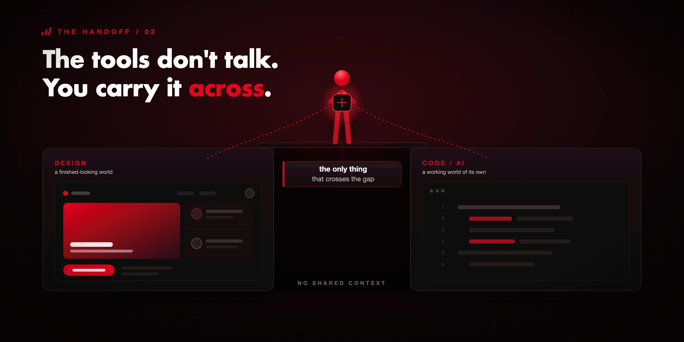
Here’s the part I keep thinking about. The design side can’t see how its own output renders in Acrobat. The code side can’t trigger an export. Each is working blind to the other, and the only connection was me. Every fix cost a full human cycle, because I was the human cycle. I’ve been working around that by exporting and re-importing and exporting again, which isn’t how it should work. We’ll be using a repo going forward, which is the actual fix.
Which is all roughly fine, until you look at what happened in the gaps. At one point a separate session got rid of a visual glitch by deleting one of the layers the page was drawn from, and while it was in there it silently dropped two letters from a name elsewhere on the page. On another pass the export was declared to render perfectly, verified with a tool that happened to be blind to the exact feature that was broken, and shipped twice carrying a visible defect.
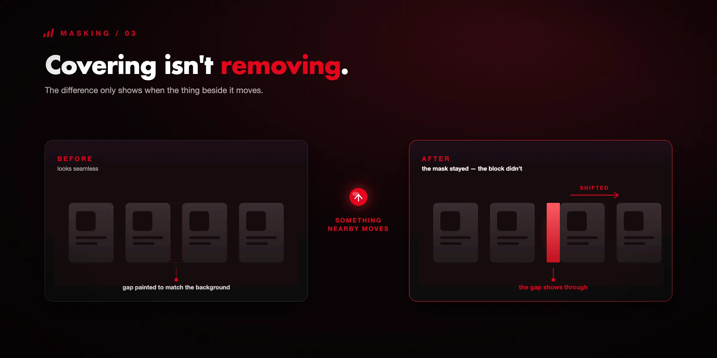
The one I find most instructive is smaller than either. On one page, images that had been sitting neatly inside their rounded containers came out with square corners. When I went looking, it turned out those images had never quite filled their containers. There had always been a thin gap around them, and much earlier that gap had been dealt with by colouring it to match the dark background instead of resizing the image to fill the box. At under a millimetre against a near-black page, it was invisible, and it held for weeks. Then a later change to the footer took some height out of that row, the gap grew to about four times the size, and the tint stopped covering it.
So the repair had addressed the appearance rather than the cause, and it quietly carried a dependency on nothing else on that page ever moving. Something moved.
None of those were things I’d asked for. All of them appeared next to something I had.
Every fix cost a full human cycle, because I was the human cycle.
The third was our own website, and it went fine. Same tools, designs in Claude Design brought into Claude Code, working on the live repo. The difference was that I could see the thing running before I merged anything to main. I spotted what had degraded in that window and fixed it before it went anywhere.
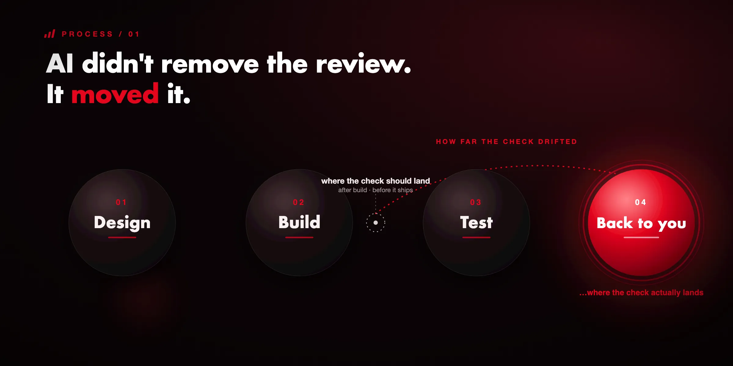
AI didn’t remove the review. It moved it.
When I put those four next to each other, what they have in common isn’t how good the AI was. It’s where I was standing when I looked.
On the website, the review point was built into the workflow. I couldn’t merge without seeing it. On Stitch, I reviewed the foundation after building on it. With the icon, I reviewed it after a developer had built it. With the PDF, I reviewed what I was fixing and nothing standing next to it.
AI didn’t remove the need for review. It moved it, because the output travels further and faster before anyone stops it. Keep the old checkpoints, work at the new speed, and things get past you that never used to.
It’s checking what you had no reason to suspect. I find that fairly irritating, and I also think it’s the job.
It also moved it wider, which is the part I keep underestimating. Two missing letters in a name aren’t a mistake in the work I asked for. Neither are the square corners, which were the delayed cost of a repair made weeks earlier. They appeared beside the work while something else was being fixed, and no acceptance criteria I could reasonably write would have gone looking for them. So it isn’t only a matter of checking earlier. It’s checking what you had no reason to suspect. I find that fairly irritating, and I also think it’s the job.
That’s not really an AI problem. It’s a process problem that AI exposes very efficiently, which is roughly what our engineers have been saying about code in AI Engineering: Idea to Product.
Testing is a design job too
I’m the only designer at a software company, so most of the people I work with are developers. There’s a version of a design I love and a version that’s sensible to build, and they’re rarely the same thing on the first attempt. Finding that overlap is much easier during the design than after it, so I try to talk to the developer while the work still looks unfinished. I ask a lot of questions that feel stupid in the half second before they leave my mouth. Nobody here has ever made me feel that way about one, which is the main reason I keep asking.
The last review point is the one after the developers have built it.
When something comes back to me for testing I’m doing two jobs at once. There’s the list, which is the acceptance criteria, the edge cases, the definition of done. We have a standard approach to that as a team, and I work from it, then decide what the criteria and edge cases actually are for the ticket in front of me. Underneath the list there’s the design question, which is different. Does it work, does it look right while it’s working, and does it still feel like the brand it’s meant to be. Those come apart more often than you’d expect. Something can pass every criteria and still be slightly off.
It’s also the first time I see a design being used rather than looked at. A layout that’s fine in a file can be awkward the moment you’re moving through it with real content and real data. So I try to go through it as a person would rather than as the person who made it, which I’m better at on some days than others.
The reason this matters more than it sounds is simple. What we catch here is what the client doesn’t, and neither do the people who eventually use it.
That’s also where the icon surfaced. The process caught it, which is the good news. It just caught it several steps after I should have.
Where I think the value sits now
I do wonder, fairly often, whether any of this still needs me. AI can produce something that looks like an interface for someone who has never designed anything. That’s a real question and I don’t think designers should pretend it isn’t.
My own experiments answer it reasonably well. The icon sets kept their character because the first few were mine and because I kept sending them back until they matched. The Stitch project drifted because I gave it a brief and nothing else, so there was no standard for it to hold to. And the PDF only came right because someone noticed a corner radius that no acceptance criteria anywhere would have caught.
So I don’t think the value is in producing every screen anymore. It’s in knowing what right looks like, deciding what everything else gets extended from, and knowing where in the process to stand so mistakes get caught while they’re still cheap.
That last one is the part I’m actively getting better at, because it used to happen by itself.
That’s not a checkpoint. That’s a hope.
What I do now
Four things, all of which I learned by getting them wrong.
Front-load the material. Assets, references, brand direction, real examples. The quality of what comes back tracks almost exactly with what I put in, and a good prompt with the right attachments removes about half the fixing I’d otherwise do at the end. My perfectionism is still doing the work. It’s just moved to the beginning.
Talk to the developer while it still looks unfinished. During, not at handoff.
Review the foundation before building on it. If a tool generates a design system or a set of base frames, that gets looked at properly before anything sits on top. It’s the least enjoyable part and it’s the one I skipped.
Check what you didn’t ask about. When AI fixes one problem it can quietly move something standing next to it, and that change is invisible if you only look at the part you were working on. Two habits come out of that. Don’t take “this renders correctly” as an answer without seeing it yourself, because on the PDF it was verified with something blind to the broken feature and reported as fine twice. And when a fix works, check whether it removed the cause or covered it, because a cover holds until something near it moves.
The question I ask now
I don’t yet know where the source of truth should live. At the moment the design file is the truth on some projects and the repo is the truth on others, and I can feel that becoming a problem the moment both are moving at once. That’s the next problem I want to solve properly rather than work around.
But what I’ve actually landed on is smaller and more useful than that.
For any step where AI is doing the work, I ask what would have to be true for me to be unable to skip the check. On our website, the answer was easy. I couldn’t merge without seeing it running, so I saw it. On the icon, the honest answer was that nothing would have stopped me, and I’d have needed to remember. That’s not a checkpoint. That’s a hope.
So that’s the test. If all that stands between a mistake and a client is you remembering to look, you don’t have a process yet. You have a good intention and a fast tool, which is a worse combination than it sounds.
None of this is a complaint about the tools. I’m not going back to the long route and I wouldn’t want to. What’s changed is where the care goes. Less of it in the making, more in the decisions at the start and the checking at the end.
That suits me more than I expected. The part I’ve always cared about is whether the thing is right, not whether I got there the clever way. It’s just that right has gotten considerably bigger since I was painting sugar labels. It used to mean the finish. Now it means the product does what someone actually needed, which is not always what they asked for, and that it looks like it was made on purpose while doing it.
I’m still working out the process. I’m fairly clear on what I’m aiming at, which I think is the more useful half to have.
At One Eleven, we build software the same way we think about it: code is the medium, value is the point. We work to make sure clients never walk out of a review wondering what it was all for.
Start a conversationJessica Bland
UX Engineer & Designer
Bridges design and code, turning a wall of ideas into one clean, simple experience that ships.